DRIFT MAGAZINE BLOG
FINAL CUT
WEBSITE LINK
___________________________________________________________________________________
RESEARCH
MUSIC VIDEO
What is a ballad?
A ballad is a form of verse, often a narrative set to music. Ballad songs tell a story, and can be dramatic, funny or romantic.
Who are Warner Music group?
Warner music group are a multinational entertainment and label conglomerate. They are one of the ‘big three’ recording companies, behind Sony and Universal.
Which artists are currently signed to this company?
Artists such as Ed Sheeran, Cardi B, and Bruno Mars are currently signed to this company.
___________________________________________________________________________________
MAGAZINE
What is a style magazine?
A style magazine mainly focuses on fashion, beauty and lifestyle, and offers content related to trends, products, and advice in these areas.
Conde Nast is a global media company that operates and owns iconic brands across print, video and digital.
Which magazines do this company currently own?
They currently own Vogue, The New Yorker, Vanity Fair, and many more.
___________________________________________________________________________________
1940s- Jazz and crooner ballads
Jazz, blues, big band music
1950s- Rock and roll, Doo-woop ballads
Rock and roll, country, jazz
1960s- Folk and rock ballads
The folk revival, protest movements, early rock
1970s- Power ballads and soft rock
Rock, soul, progressive music
1980s- Rise of power ballads
1990s- Pop, R&B, acoustic ballads
Alternative rock, grunge, R&B
2000s- pop ballads and emo-rock ballads
R&B, alternative rock, hip-hop
2010- Emotional pop and indie ballads
Electronic music, indie folk, neo-soul
2020s- Evolving ballads in pop and indie
Lo-fi bedroom pop, alternative folk
___________________________________________________________________________________
Options for making visuals:
Daniel Powter- Bad Day
- Split screens with different characters
- Downward ariel shot of piano
- Use of time
___________________________________________________________________________________
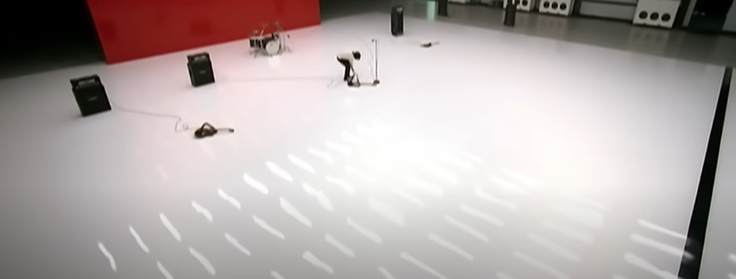
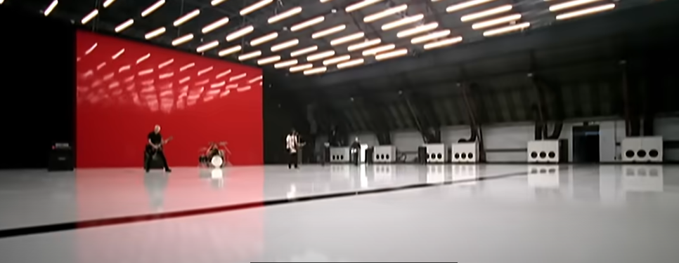
EXAMPLE OF MUSIC VIDEO
Foo Fighters- The Pretender
First shot- establishing shot
Close up shot
Lead singer making eye contact with camera- shows that he wants to prove a point to audience
All dull colours except vibrant red backdrop
___________________________________________________________________________________
FIRST ROUGH CUT:
WHAT IS COMPOSITION?
- Compose, Position
- The arrangement of elements in an image or shot
Composition is made up of these different elements:
What you want the viewer's eye to be drawn to
Uncluttered so that there is a focus
Shot types: golden triangle, grid method (rule of thirds), focal point
Leading lines- your eyes are drawn up the road
Give the photo direction and mood
Bring a visual unity to the frame
Different shapes convey different feelings
Where you position your subject
The larger the object in the frame, the more important
Negative space, positive space
Gives 3D effect
Interests viewer
Foreground, middle ground, backgrounds
Photos should have balance
Symmetry
Helps keep an image organised and stable
What we are seeing and how we are seeing it
High angle makes subject seem small and less powerful, low angle does the opposite
Can help direct the viewers eye
Tone- the contrast within an image
Keeps focus on the subject
___________________________________________________________________________________
HAND DRAWN DESIGNS
I showed my website plan to a selection of my target audience. This allowed me to develop a clear idea of the layout of my website, as well as what my target audience wants within a website.
___________________________________________________________________________________
STYLE INSPIRATION- VOGUE
My main inspiration was the Vogue website. I took inspiration mainly from the layout of the website, as I liked how easy it was to navigate. Therefore, I used similar attributes in my website as the Vogue website, such as the horizontal navigation bar and clear titles. I wanted to create a brand identity for Drift, so, whilst creating my magazines, I decided to stick to a blue theme as I thought that it matched the light, outdoorsy feel. I then followed this blue theme through onto the website, and had things such as the title and page backgrounds in a blue colour, so that a brand identity could be formed.
Due to the fact that my magazine is newly released, I wanted to keep the amount of models somewhat minimal. Therefore, I used the same models as the ones in my magazine, and included a few extra models. I did this because it will allow readers to recognise the models - making them more likely to become a subscriber to the website, or a frequent visitor. I shared the models names so that the readers would be able to easily know who they are, and recognise them. I also kept a few consistent fonts throughout the website that match the ones on my magazine, as consistency is important.
___________________________________________________________________________________
STYLE MAGAZINE DISTRIBUTED BY INDEPENDENT FILMS
A style magazine that I found that is distributed by an independent film is a magazine called Tank. Tank is a UK-based, independent magazine that covers contemporary culture, fashion, art, architecture, and technology. It was originally founded in 1988, and is based in London. Each issue typically has a theme or concept. Some examples include disorientation, bubbles, or the city. The magazine has very few ads- reportedly no more than 5% of content. This supports its independent and editorial-driven identity. Over the years, tank has changed its physical form- from pocket sized books and wire-bound magazines to rectangular magazines. The design has strong photography, curated interviews, and high production values. Tank is built to feel collectible and timeless. Pricing varies, but recent issues list for around £15.
___________________________________________________________________________________
TEXTUAL ANALYSIS
Vogue
Vogue has very clean-looking camera work, with simple but effective poses. I took this into consideration when shooting my photos for the front cover of my magazine, as I wanted it to have a similarity to Vogue. Vogue keeps their editing very clean and simple as well. Their website is mainly black and white, with plain text. Although I did like this, I wanted to incorporate some colour into my website as well, so I followed a blue theme. Typography in Vogue’s magazine was kept minimal, so I didn’t write excessive amounts as I wanted to keep it similar. I used short and catchy lines to grab the reader’s attention on the front cover. Vogue’s mise-en-scene was kept very structured and had a clear layout, so I made sure that images were lines up well, and that text was centralised.
Harpers Bazaar
Harper’s Bazaar consists of a similar vibe to Vogue. On their website, they had a lot of paparazzi-style shots of celebrities. Their camerawork was kept quite plain with little amounts of editing. Their website follows a black and white theme, similar to Vogue. Their typography is kept quite simple. Their mise-en-scene has a clear layout. Harper's Bazaar's mise-en-scene is kept very consistent throughout their magazines, with a clear masthead on each cover and one person as the main image. They use a lot of celebrity endorsement.
___________________________________________________________________________________
PERFECT AUDIENCE MEMBER
My perfect audience member would be a woman aged 16-25, as this is my target audience. The clothes that they wear would be similar to the drift models' clothing. The food that they eat would be similar to the food on the travel page of Drift, as this page gives them inspiration for food and restaurants. My magazine will attract the perfect audience member because I will promote the magazine on social media platforms such as Instagram and X, and use hashtags to reach people who may enjoy the content.
___________________________________________________________________________________
KEY ELEMENTS
Some key elements that I must include in my magazine in order to conform to expectations of the genre are a clear masthead, diversity, clear cover lines, and a consistent theme throughout. The audience that I will expect is a female age 16-25 as this is my target audience. For my website, some things that I need to include are a clear layout, navigation bar, images, and stories. I will include these in order to conform to expectations of the style magazine genre. For my audio visual, I need to include a model, and edit it with text and music. My plan for my audio visual is to use Connie Yeomans and have her do a 'never have I ever' video. I came up with this idea because I think that it is something a 16-25 year old audience would like to see.
___________________________________________________________________________________
MOOD BOARD
I created a mood board to allow me to have some inspiration for my magazine. I chose these images because I really like the colours that were used, and how vibrant they are. It follows the style magazine genre, so I wanted to take inspiration from it.
___________________________________________________________________________________
LOGO
I created a logo for my magazine, that I will also use on my website. I wanted the logo to be simplistic but effective, so I used the same font as the masthead on my magazine. The font is easily recognisable, and by looking at it, people will know the name of the brand. This will make the brand more well-known and recognisable.
___________________________________________________________________________________
SHOOTING
After planning my photoshoot, I took the photos. I decided to go to a field to take the first set of images, as I thought that it gave an outdoorsy feel and linked to the theme well. I wanted to take my other front cover image in a studio in order to change the location so they didn't all look the same. I went to a photo studio to take these images.
This is a behind the scenes image of the photoshoot. I decided to cast my two main models- Connie and Arisha for my covers. I wanted to have models of two different ethnicities, in order to have diversity within my magazine. Arisha is Indian, and Connie is British, so this shows diversity.
___________________________________________________________________________________
ROUGH CUT
___________________________________________________________________________________
I created the web pages on WIX. This allowed me to create them to my liking, and take inspiration from magazine websites such as Vogue. This is the link to my web pages:


Comments
Post a Comment